Ticket flow
James Aylett, Friday 14th October, 2016
This excellent piece on code reviews by Mathias Verraes reminded me of something I generally try to do that has almost nothing to do with code reviews, which is how I operate on ticket flow. The bit that triggered me was this:
Another effect is something called ‘swarming’ in Kanban … Stories are finished faster, and there’s a better flow throughout the system.
What do we mean by ‘better flow’? For that matter, what do we mean by ‘flow’ in the first place?
What is ticket flow?
You can think of each piece of work that a team does as flowing across the team’s different functions. The tickets in your development have a number of states they go through, from “new” (before anyone has done any substantive work) through to “deployed” (live, or part of a released version). Here’s a simple example:

Every piece of work that’s valuable has to get to that final state, so the flow of tickets is the tickets moving through those states from new to deployed.
Ticket flow therefore is one way of thinking about the work that the team does. But why does it matter?
Why is flow important?
If you’re familiar with Lean software development then you may already have some thoughts here. One of the principles in Lean is to deliver as fast as possible, which broadly means that we want tickets to move as quickly as practical through to deployed.
However there’s another Lean principle that’s pertinent here: eliminate waste, and in particular the waste of waiting, which in software development terms means tickets sitting around in one state when they should be moving forwarding toward deployment.
That may sound ideological, but it often makes intuitive sense. For instance, developers generally would prefer to get changes through code review as soon as possible after they do the work, so they can shift their focus completely onto the next piece of work. Worse, with continuing work by other people introducing changes to the system, incomplete work can become harder to integrate over time.
If you’re talking about eliminating waste in your process (which is one of the Lean principles for good reason), then you’re aiming to reduce the time taken to do things to as close to what’s possible as you can.
So flow is ‘better’ when…
So a better flow in this sense will be one where waiting time is minimised. In other words, ticket flow is better when it’s smoother, ie when tickets move forward without significant hold-up. In practice, each state has some minimum time to get through to the next; it takes time to actually build the feature, to go through code review, and so on. But if you have waiting time, then you have waste you can work to eliminate.
However it’s not always practical to measure the waiting time of tickets. For instance, when a piece of work enters code review, what happens is that it waits until someone has time to look at it. Then the work of code review begins as that person looks at the code. After a while they may make some comments, or ask for changes. Then the ticket will go back into waiting for either the original developer to address the review, or for another person to review it. All your review system is likely to record is when individual comments were added, or when changes were added by the original developer. For some of the time between the ticket is waiting, and for some of the time it’s being worked on. If we can’t measure them directly, we should look for a way to approximate the figures we care about.
A lot of development trackers will provide figures for something called cycle time, the length of time taken from when the ticket is picked up (moved from new into “in progress”, or whatever the “being worked on” state is) and finally marked as complete (deployed, in our case). However this doesn’t tell us much either, because cycle time obscures all of the waiting at different points in the ticket’s flow.
However if we have the cycle time for each ticket, we can visualise the distribution of cycle time.
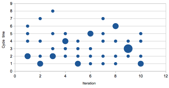
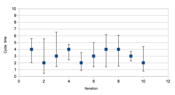
We can also calculate some aspects of that distribution. The average isn’t going to be terribly interesting, but we can also calculate the variance, a measure of how spread out the different cycle times are. A larger variance means less consistency in time taken to complete the work.
And if we can calculate this for the entire cycle time, we can also do so for the transitions from one state to another in the ticket flow.
Why is lower variance better?
Say we just look at time taken to get out of the code review state. The average of recent times gives us an idea of how quickly we can expect a ticket to pass through this state. However if that time has high variance, then some tickets will take longer. Some will take less time.
There are a few reasons this might be the case. Perhaps some types of work are intrinsically harder to review and so take longer. Or perhaps one member of the team takes far longer than others to review. Perhaps one member of the team presents code for review in a way that takes longer to digest. High variance won’t tell you what the problem is, but it will highlight that there’s something going on that you should look into.
I’ve heard people object that since the size of pieces of work isn’t particularly consistent, the variance will naturally be higher. You can either divide times by your estimate for the piece of work to try to normalise this data, or you can work to try to break work up into more consistently-sized pieces. Although it may sound like that’s changing your process to fit your measurement abilities, there are other benefits to having more consistent sizes for work — notably that they’ll probably be consistently smaller as well, which makes it more likely for instance that each piece of work can be code reviewed in one session.
So we can plot average and variance for the different times taken for tickets to pass through the various states. That will give us a way of identifying higher variance steps, and also if variance (and average) are decreasing over time, or at least not increasing.
However there’s another graph we can draw, without any timing data at all, which gives us a direct way of visualising the ticket flow. Enter the flow graph, where we graph stacked counts of the different states.
Graphing the flow itself
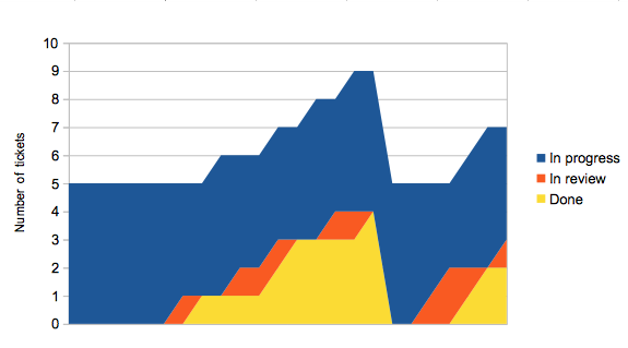
Consider having five team members. They each pick up a piece of work, and when they finish their work item it goes into review. They then immediately pick up another piece of work. Sometime later, once someone’s had a chance to review their earlier work, and they’ve had a chance to make any changes, the ticket moves to done. Every so often someone notices there’s some work waiting to be released, and everything in done moves to deployed.
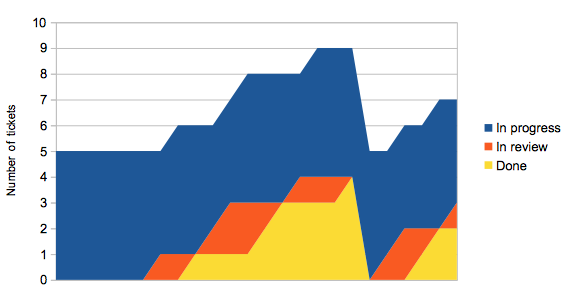
This doesn’t look very smooth, which we should expect because of phrases like “sometime later” in the description above.
Let’s look at a slightly better scenario, where tickets are reviewed almost immediately.
In review tickets pass through to done faster now, but unless we also deploy more regularly the overall shape of the graph doesn’t change much. If we change things so that once someone’s work has been reviewed, they’re responsible for getting it deployed as soon as possible, things start to look a lot better.
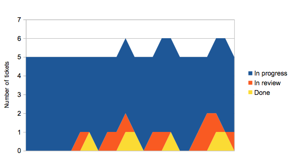
The ‘surface’ of the flow graph tells you how many tickets are ‘in flow’ at any one time — they’ve been picked up but not yet deployed. If your tickets are all a sensible size, and assuming you have a large enough team, this should remain largely constant over time. There’ll be a little variation, for instance if people claim a ticket and start thinking about it while waiting for CI to run ahead of a deploy.
As you’d expect, the overall cycle time is lower in the third scenario: around 12.5 time units rather than 18 for the first scenario. The step cycle times are also better, and crucially their variance is a lot lower. But the most important thing is that in the third scenario, more features were deployed in that time range than in the first; there aren’t completed features waiting around to be deployed.
Note that over the long-term this may not mean you get any more work done within the team. However that work gets out to users faster; the waste that’s been eliminated is waiting time of the work, rather than inefficiency of any team member doing a particular task. (This means that a team of excellent developers and designers can still have inefficiencies in their process which you can work to reduce.)
Summary
Ticket flow is a way of thinking of work flowing through your team. We can use that to investigate potential problems, sticking points in your process that you should look at. Looking at the distribution cycle time and time taken within each state of your process gives a direct numeric representation, or by using a flow graph you can see the ‘smoothness’ of your process.
The last time I needed this was with a team that used Target Process with a monitoring system based on statsd, and I created a small python script that pulls counts of TP entities out of their API and feeds them to statsd.